
The Renaissance (ca. 1330-1600) is often remembered for its revival of Classical literature. Modern books like The Swerve celebrate the Renaissance era book hunters such as Poggio Bracciolini, who travelled to hidden monasteries in search of Latin manuscripts of Virgil or Cicero, and uncovered lost works, such as Lucretius’ De rerum natura. However, the Renaissance was also a time for rediscovering Latin and Greek inscriptions from classical antiquity. The famed Bracciolini not only found new literary works, he also transcribed the myriad Latin inscriptions he encountered on his journeys. Both newly discovered and long-known inscriptions served to inspire the new fonts used in printing presses in Western Europe, to play into the cultural battles waged by the Church during the Counter Reformation, and to inspire a number of forgeries of classical objects. Above all, the epigraphic Renaissance of the 15th century helped shape a new typographic landscape that we continue to traverse today.

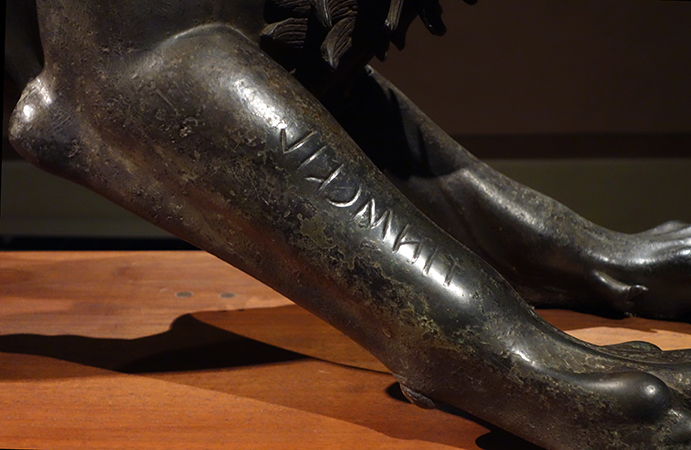
One of the best known of these inscriptions resides on the so-called Chimaera of Arezzo, which dates to around 400 BCE. It was discovered near the Porta San Lorentino in the ancient Etruscan city of Arretium (Italy) in the year 1553. On the Chimaera’s right foreleg is inscribed ‘TINSCVIL’ (“for Tinia”), a dedicatory inscription addressing the head Etruscan god, Tinia. The Chimaera was itself a mythical beast that fused numerous animals together: A Lycian lion that breathed fire, with a serpent tail and usually a goat mixed in. After the bronze sculpture was unearthed, the Etruscan statue was added to the collection of Cosimo de’ Medici and placed in his grand palazzo in Florence. Today it resides in the Museo Archeologico Nazionale in Florence.
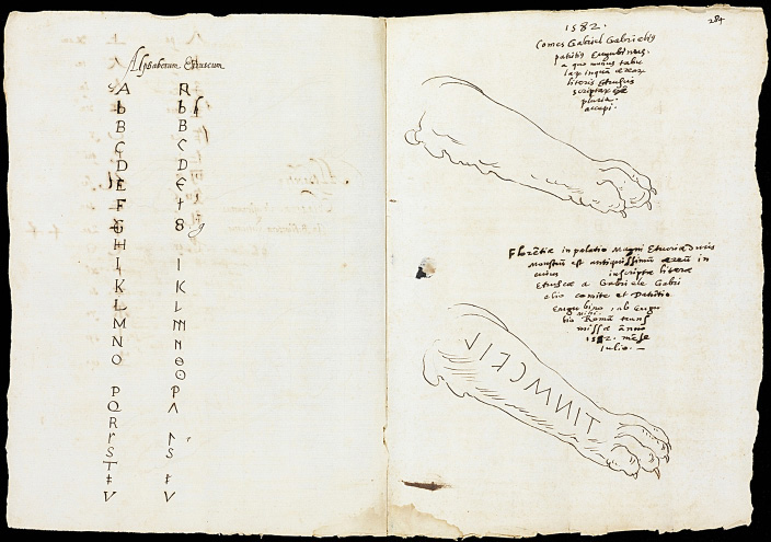
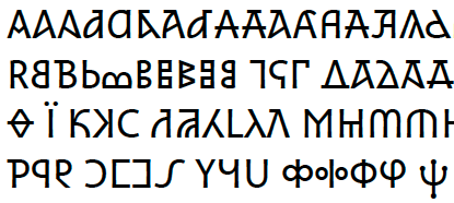
The discovery of the Chimaera of Arezzo (interactive display HERE) enthralled a number of artists, such as Alfonso Chacón. Chacón was a 16th c. Spanish humanist who worked in Rome and drew, transcribed, and recorded hundreds of Roman antiquities and their inscriptions in his work, De antiquitatibus Romani. His 1582 drawing of the Chimaera reveals a personal fascination with not only the paw of the sculpture, but also the Etruscan alphabet inscribed on it. To the left of the transcription, he wrote out the Latin alphabet in his own print, and then shows the parallels in the Etruscan alphabet side-by-side. His engagement with the inscription was part of a wider, more popular interest in manuscripts (i.e., scripts written by hand) that had grown since the invention of the printing press in the mid 15th century.
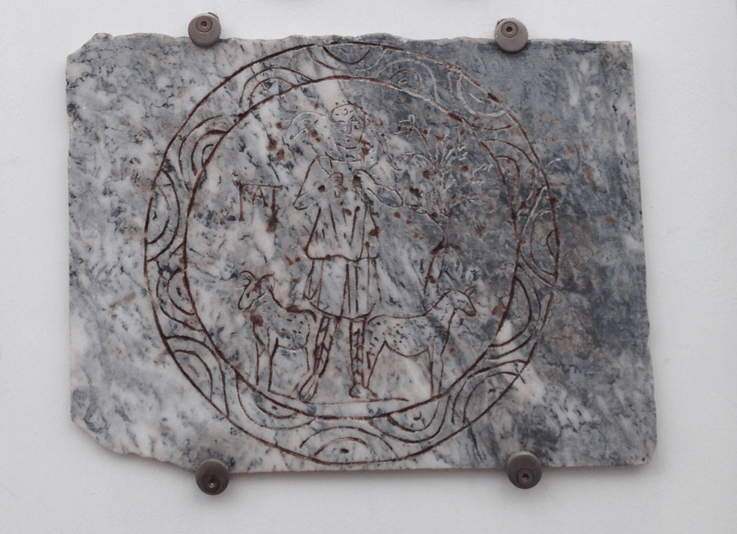
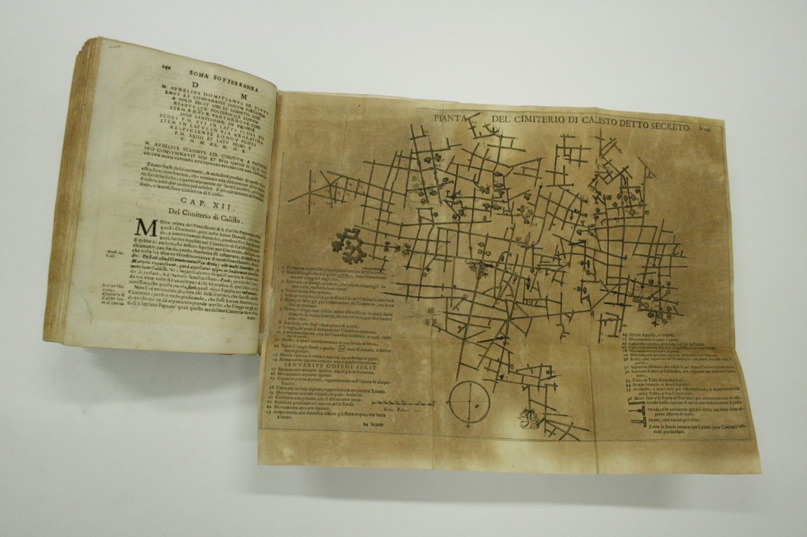
Epigraphy and lapidary scripts became a fascination for Catholics involved in the counter Reformation as well. One of the foremost Renaissance epigraphers was Antonio Bosio (1575-1629), who drew and then published a number of epitaphs pulled from the newly rediscovered Roman catacombs (Mazzoleni 2014). These inscriptions put the antiquity of Christianity on display, gave a voice to ancient Christians, and–at least to viewers–served to validate the association of the catacombs with Christianity and martyrdom.
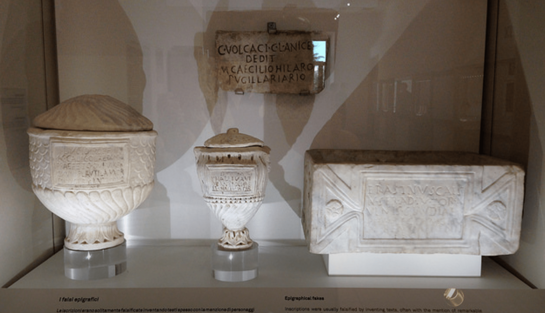
The Renaissance was chockablock with copyists who learned and then duplicated Latin epigraphic scripts for various purposes. This imitation game had a great amount of influence on the Renaissance antiquities market at the time (forgeries could be bought all over Italy), but it is also revealed in the fonts we use today–particularly Roman fonts. The invention of fonts by various printers and typesetters in the 15th and 16th centuries was often inspired by lapidary inscriptions from the catacombs or pulled from manuscripts recording antique stones. After all, these inscriptions were increasingly displayed in the houses of the Roman elite, by popes, in churches, and in newly established museums.
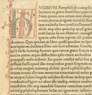
Printers began to compete to create fonts that evoked classical antiquity while upholding the aesthetic ideals of symmetry and beauty. One of these printers was Nicolas Jenson, who lived in Venice and produced an edition of Eusebius’ De evangelica praeparatione in 1470 that was celebrated for its readability and close approximation to classical lapidary inscriptions. The Renaissance architectural ideals of symmetry and proportion were similarly expressed in new typescripts.
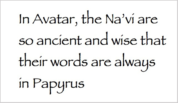
Although computer fonts have changed since those used in the Renaissance, remnants of the influence of epigraphic scripts on typographers remains today. The famed Times New Roman font was not invented until 1931 or 1932, by Stanley Morison for the London Times. The font drew on Renaissance fonts that had, in part, used classical inscriptions as models. However, other modern fonts that imitate ancient scripts have not been as successful. For instance! Ask any papyrologist or epigrapher working today, and they will likely tell you that they hate the font ‘papyrus.’ Every poster for a talk on ancient Egypt since its invention has had that damned font imprinted on it since about 1982, and it really is overplayed. However, its attempt to tie epigraphy, culture, and legitimacy together is much the same as the Roman fonts invented during the Renaissance. One of my favorite sites is ‘iheartpapyrus.com’, which mocks (among many others) the movie Avatar for trying to make the Na’vi language more authentic and antique by using subtitles that employ the papyrus font. Nice try, James Cameron, but font alone cannot legitimize a language or a piece of writing.
The field of digital epigraphy today is about more than just translating and transcribing inscriptions and posting them online. It is still an art form, I swear! As modern typographers attempt to translate epigraphic scripts into digital scripts, they must also work hard to preserve the ligatures, symbols, character, and aesthetic feel of an inscription or a papyrus. Only then can we truly recreate the experience of viewing an inscription digitally when a picture is no longer available or accessible. The creation of epigraphic fonts like Dumbarton Oaks’ 2013 Athena Ruby Inscription Font demonstrates how challenging, but also how necessary it is to understand the material source before you try and translate it to a digital canvas. Epigraphy hunters traveling around Europe during the Renaissance grappled with how to draw ancient inscriptions, typographers struggled with how to translate it into print for new readers, and now digital epigraphers must try and capture the beauty of Greco-Roman inscriptions online for a new generation of Renaissance men and women to enjoy.
Further Reading:
Silvia Orlandi, Maria Letizia Caldelli, and Gian Luca Gregori, “Forgeries and Fakes,” in The Oxford Handbook of Roman Epigraphy (Oxford: 2015): 42-65.
Michael J. Waters, “Francesco di Giorgio and the Reconstruction of Antiquity: Epigraphy, archeology, and newly discovered drawings” Pegasus – Berliner Beiträge zum Nachleben der Antike 16 (2014) : 9–102.

Leave a comment