This week, The Chronicle of Higher Education published a piece (now behind a paywall) written by Prof. Timothy Brennan. In it, the digital humanities as a field is essentially assessed as a “bust.” A concluding critique seemed particularly harsh: “Rather than a revolution, the digital humanities is a wedge separating the humanities from its reason to exist — namely, to think against prevailing norms.” Although I and many others who engage with DH have a number of qualms with this assessment, I decided that one way to rebut it was simply by exploring one sub-field largely excluded from the article: GIS and digital mapping.
What is below is a transcription of my Forbes column for this week, which looks at how digital mapping has changed our understanding and access to issues regarding race, segregation, and social justice in the United States. I think that Prof. Brennan might wish to see just a few of the DH projects that challenge “prevailing norms.”
____
How are mapping projects changing the way that we understand our history of racism, segregation and prejudice in America? A number of digital projects are now using GIS (geographic information systems) in order to geolocate social justice movements, visualize both historical and present racism and highlight racial issues, all using the familiar interface of the map.

An interactive map of Washington D.C. in 1860 shows the segregation of people of color within the city through a new project called ‘Placing Segregation.’
In order to explore the impact of spatial humanities on social justice issues, I spoke to GIS specialist Dr. Rob Shepard, creator of the new ‘Placing Segregation’ project, which combines the geolocation of hundreds of written records with historical maps in order to visualize segregation in mid-19th century American cities such as Washington, D.C., Omaha and Nashville.
People of color have been using maps to visualize racism for a long time. As Shepard notes, “W.E.B. Du Bois famously geolocated and documented basic socioeconomic information about individual households in The Philadelphia Negro, as part of a sociological study in the 1890s. Consequently, the granular GIS-style approach I’ve been using in mapping residents for Placing Segregation – and my work with the project Civil War Washington before it – is not completely unique or special to digital humanities. And I don’t claim that.”
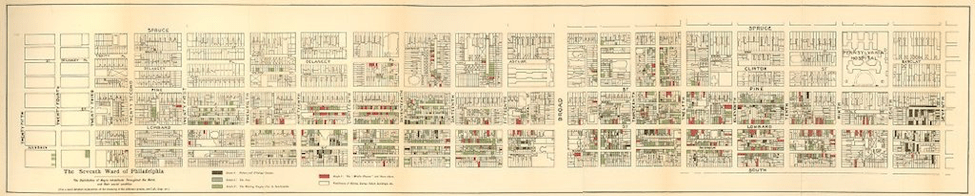
Map by W.E.B. Du Bois of Philadelphia’s Seventh Ward drawn in 1899.
Many prominent African-American activists at the time turned to maps and other data visualizations in order to help the public–and even the president–to understand the detrimental effects of slavery on the country. In 1900, W.E.B. Du Bois, Booker T. Washington and a lawyer by the name of Thomas J. Calloway began to develop visualizations for display at the Paris World Fair.
As Allison Meier noted in an article on these visualizations, “Du Bois’s charts (recently shared by data artist Josh Begley on Twitter) focus on Georgia, tracing the routes of the slave trade to the Southern state, the value of black-owned property between 1875 and 1889, comparing occupations practiced by blacks and whites, and calculating the number of black students in different school courses (2 in business, 2,252 in industrial).” Data visualizations, now a key part of digital humanities approaches to organizing and visualizing archived records, have in fact long been a (analog) tool used to illustrate the suffering of African-Americans in the U.S.
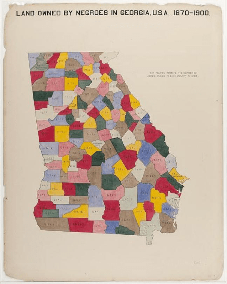
W.E.B. Du Bois created a map called: “The Georgia Negro: Land owned by Negroes in Georgia, U.S.A. 1870-1900” for the 1900 Paris Exposition.
In the past decade, as the movement towards digital approaches to history have gained steam both within universities across the country and in journalism, historians addressing race have again returned to the earlier methods established by African-Americans following the Civil War.
Shepard remarks on just a few of these projects and their ability to teach students using free resources online; a movement to democratize information called open access: “These resources are freely available to classrooms and students who have so much to gain from accessible information. University of Richmond’s Visualizing Emancipation project for instance, not only provides its research GIS data for download and use, but also the team has developed accompanying lesson plan documentation and the site encourages higher education instructors to get in touch with the team for more specialized assignments using the geographic datasets.”
It says a lot when a university within the former capital of the confederacy begins to invest heavily in visualizing and teaching the American history of inequality. Such projects often depend on federal funding agencies like the National Endowment for the Humanities.

The University of Richmond’s Visualizing Emancipation project maps slavery’s end during the American Civil War. The project is partially funded by the National Endowment for the Humanities.
Today there are dozens of digital projects focused on the African-American experience. Recently, The Colored Conventions Project housed at the University of Delaware brought together an epic list of over a hundred such projects. The list of digital initiatives include Mapping the Stacks, which visualizes Chicago’s black community archives from the 1930s to the 1970s. As I have previously noted, the Equal Justice Initiative has also launched the Lynching in America project, which provides access to interactive maps, archival documents and oral histories of lynching in the U.S.
The impact of these projects goes far beyond visualization; they champion a novel approach to informing the public. Pier Gabrielle Foreman, a professor of English and Black American Studies & History at the University of Delaware and the founding director of the Colored Conventions Project notes the import of such digital work in terms of information and preservation: “In the West, so many of the documents that record Black history have been devalued and discarded. Now they exist in remnants, a single letter instead of a full set of correspondences in in one collection, a single newspaper instead of a full run in another library. Digital Humanities projects allow researchers to better piece together this scattered archive. In the case of the ColoredConventions.org, we have been able to help reassemble the records of six decades of nineteenth-century Black political organizing–for voting and legal rights, for educational access, justice and jobs.” Digital Humanities can be used as a form of high-tech quilting that likewise stitches together disparate parts of the past.
Digital mapping and database construction can allow us to reconstruct, preserve, and visualize vestiges of the past, but academics engaged in this work are often dependent on the public for aid. As Foreman notes, “Without the distributed, collaborative and collective work of volunteer transcribers, national teaching partners, librarians and student leaders, this work would not be possible. Though this is collective work, we have a better sense of how long Black people have been organizing for civil rights—and how consistently those rights have been denied.”
Additionally, digital mapping initiatives can react to crisis in real time. Recent map-a-thons at Columbia University, MIT and at Princeton’s digital humanities center, for instance, have brought together academics and the public to use open-source mapping to aid the hurricane relief efforts in Puerto Rico.
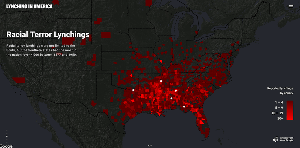
Interactive map of the Lynching in America project from the Equal Justice Initiative.
Projects like Placing Segregation, Lynching in America, The Colored Conventions Project and myriad other digital humanities projects exemplify that there is a great deal of in-depth assessment and interrogation happening within digital projects that goes well beyond amusing data aggregation. From W.E.B. Du Bois to today, the use of geographic visualization has frequently been grounded in allowing the public access to crucial information. In the process, these maps and the humans behind them have taught us about the devastating impact of racism.

Leave a comment